employer
Howard Brown Health is a collection of clinics providing LGBTQ affirming and trauma-informed care to Chicago’s many ethnic, gender, and economically diverse citizens.
Howard Brown Health’s purpose within the Chicago medical service landscape is to address the unique needs of their queer, financially diverse patient population. It can be very difficult to find plain-spoken, direct, and trauma-informed care with any consistency, even in a city with as many option and resources as Chicago.
The visual direction I provided produced deliverables that continuously emphasize the HBH focus on competent care for historically underprivileged populations in Chicago.
goal
Reinforce HBH’s overall visual brand through external + internal campaigns, documents, signage, and form deliverables
DUTIES
Visual Communication strategy + planning, ethnographic research, market research, design support, digital file organization, print (pre + post press) management
Brand Deliverables


TARGET AUDIENCE
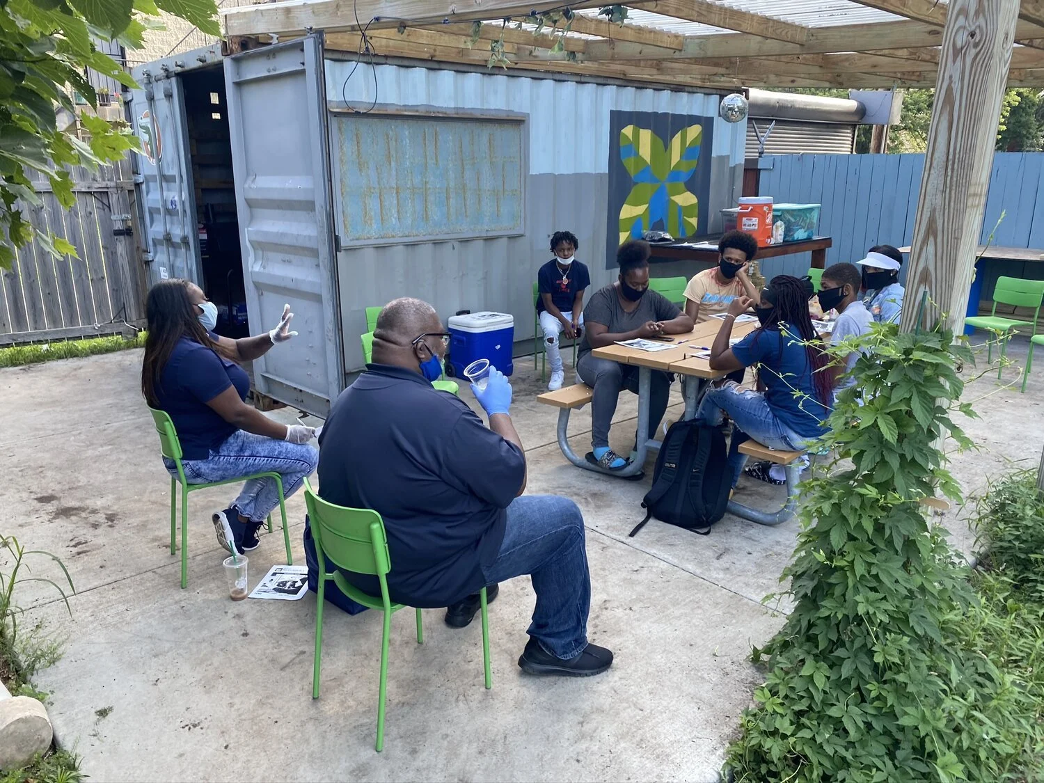
Parents and guardians of Chicago students with an incarcerated family member.
NEED
How will One for One bring awareness of their unique non-profit and horticulture based programming to their target audience across the digital landscape?


About the Founder

In 2006, Meghan Olson’s father was falsely accused of a crime in Puerto Rico and temporarily incarcerated. A priest named Father Miguel Ferrer provided guidance, kindness, compassion, and faith to the Olson family at a time when they needed it most. Ms. Olson founded the Ferrer Foundation as a way to honor Fr. Ferrer’s life and impact on her family
interview Highlights
Ferrer Mispronunciation
“The name is hardly ever pronounced correctly. One time somebody asked it ‘Ferrer’ had anything to do with ‘Ferrero Rocher’, the chocolate brand.”
The name necessitates a retelling of Meghan’s story
Explaining the name always goes back to what Father Ferrer meant to me. That’s great but that just leads to my story.”
Focus needs to be on the kids
“The (current) name does not speak to what we do. We chose the new name and logo that speaks to more of what we do and who we do it for.”
Ethnography


strategy
As our team’s researcher, I conducted ethnographic research with One for One’s many images and videos that captured how the many students who utilize One for One’s services.
As a result, I encouraged us to brainstorm designs that would bring One for One’s digital presence to the awareness of potential students and their families, plus the restaurants and businesses that could use the produce from the program’s garden.
My team presented our plan to the judges and the client and after consideration, our team was chosen as the winner.
My team’s Designathon win meant the chance to initialize our team’s proposal into reality. Next, we began assembling the new website, whose focus would be the green initiatives and programs that mark One for One as a unique program that engages inner-city youth in horticulture.
digital brand one pagerA new website capturing the idea of exponential green growth that encourages program students to create and sustain community through their actions.
Green urban stylization and visual assets for future use and development of their website.
deliverables
TEAM PROPOSAL
To grow One for One’s profile, we will create a website and social media presence that broadcasts its brand of green exponential growth, unique horticultural-based programming, and the participants who remain positively changed in order to bring more potential participants and supporters to One for One Chicago.
One for One promotes a unique approach to improving the lives of inner-city youth. This includes the produce teens in the program cultivate and sell to local restaurants.
Their exposure to the food industry’s inner workings and community-led production is an impressive and authentically unique aspect that defines the One for One Chicago brand.
development

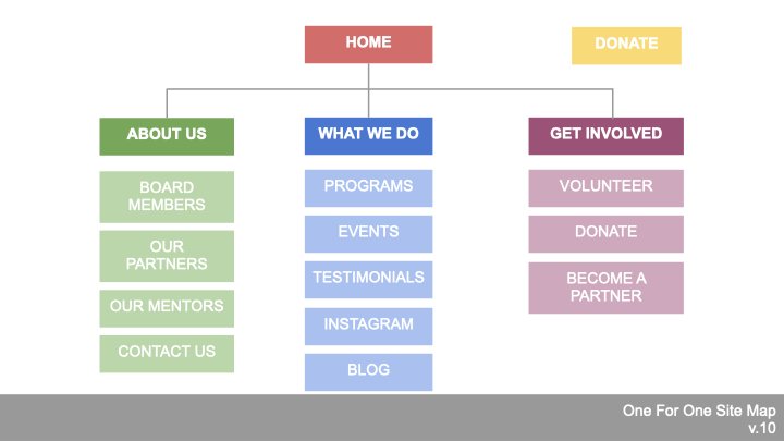
ORIGINAL Homepage
-
A modern and clean layout guides users to key content
-
Use a simple but bright color palette and images to immerse the user and encourage engagement
-
Illustrate the new One for One brand and the horticulture-based programming in every aspect of each page.
WEBSITE NEEDS

Redesign
initialize


teammate testimony
Michelle Fogiel
One for One Teammate
Current Engagement Manager at Deloitte Digital
“I had the opportunity to work with Karen while working on a project for a nonprofit called One For One. We were tasked with coming up with a redesign of their website and incorporate new branding. Karen was not shy about contributing and sharing her ideas. She listened to the project stakeholders and came up with solutions that were in the best interest of users coming to the site. She pinpointed challenges and ensured that we were addressing concerns while building the site. Karen is a great contributor and unabashedly straightforward, cutting through to the core of any project thrown at her. She would be a wonderful asset to any team”
results
Increased rate of donations
Improved recognition of the non-profit media without confusion over the company name.
Access to program forms that lead to an increase in sign-ups
In the winter of 2019, the new One for One website was launched. Designing for One for One Foundation gave my team the chance to band together for more than just design. We helped this non-for-profit make the world aware of their efforts to provide disadvantaged youth with the tools to go farther than they ever considered possible.